Reporting
Reporting is a feature that allows you to create customized dashboards. It is particularly useful for time tracking.
Reportings are presented in table format, and their construction mechanism is similar to that of pivot tables in Excel.
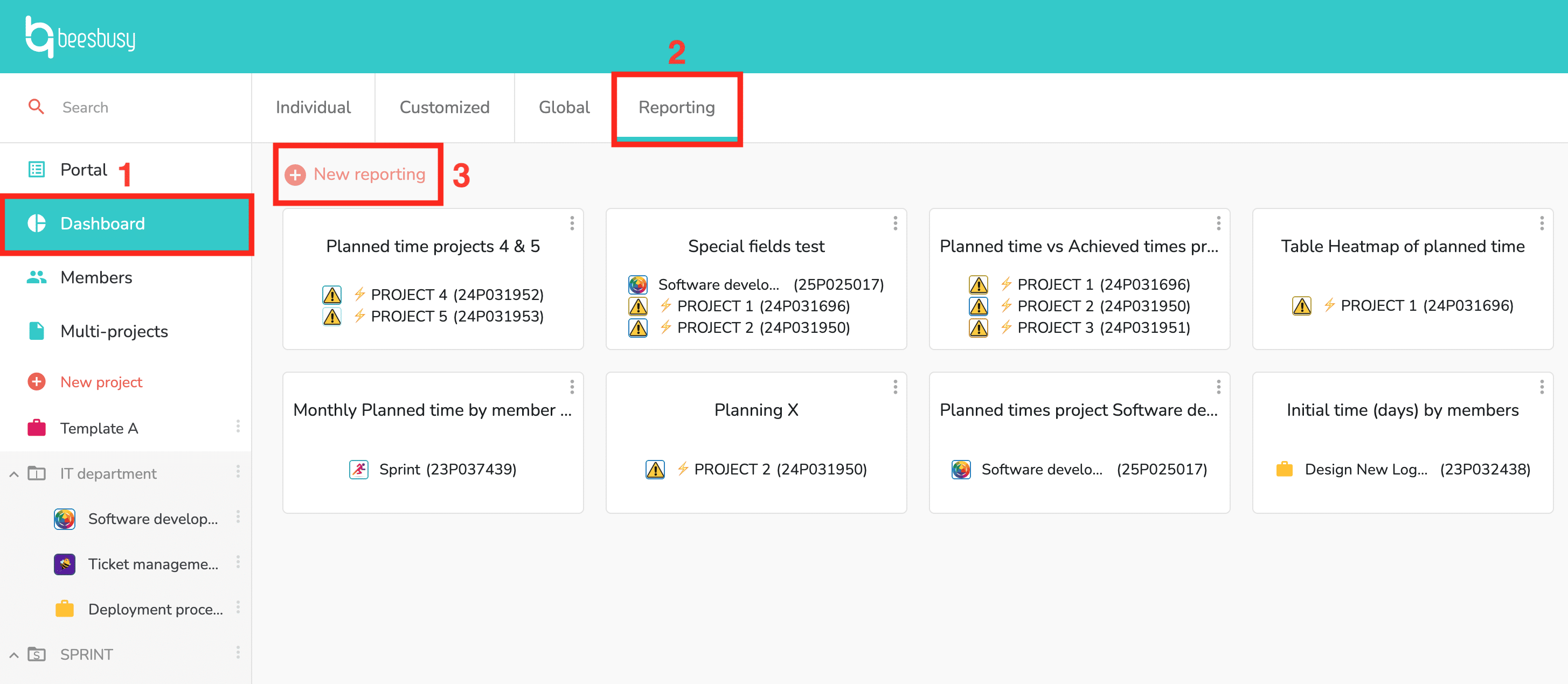
To create your reporting, go to “Dashboard”, then to the “Reporting” tab and click the “New reporting” button:
A pop-up then opens, allowing you to build your reporting:
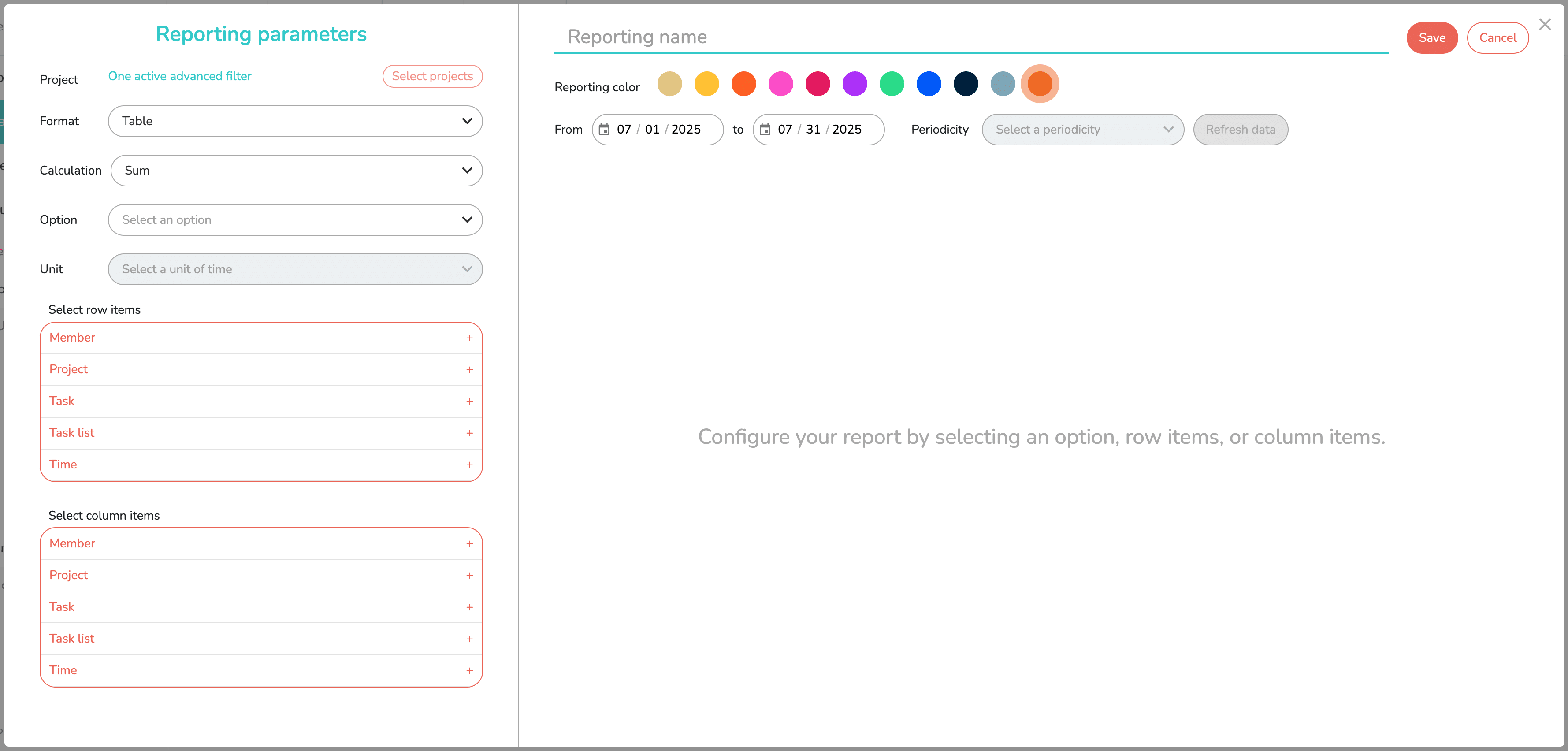
As you can see, the left section is used to configure the reporting, and the right section displays the reporting data once configured.
In this article, you’ll see how to configure the reporting, then how to display the data.
Reporting parameters
Choice of one or more projects
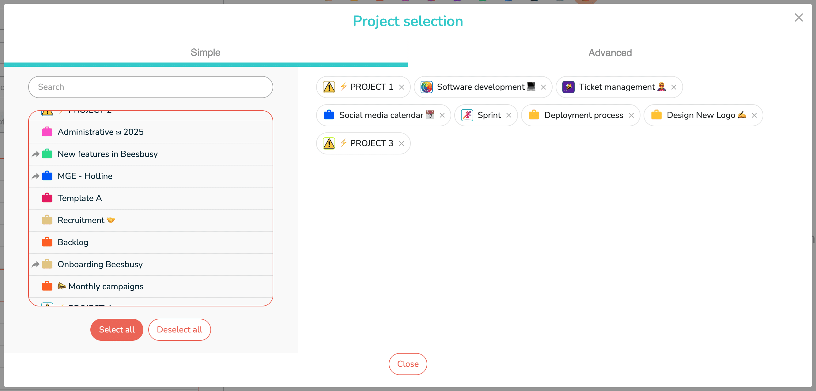
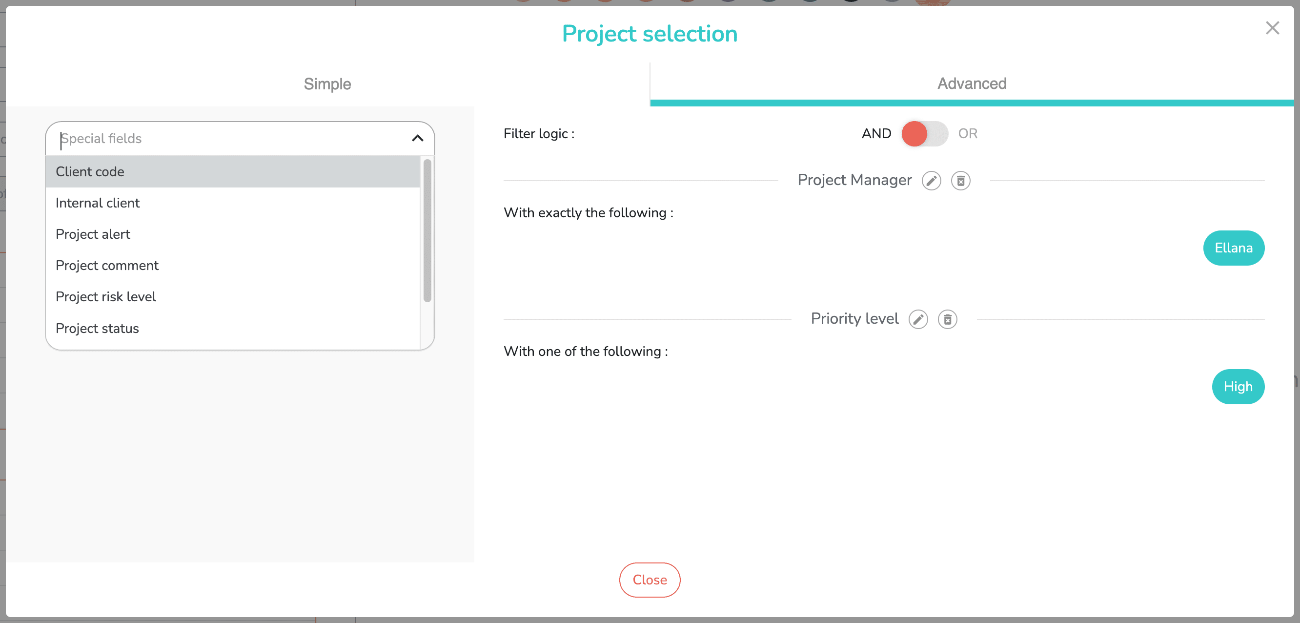
When you click the “Select Projects” button, a pop-up window opens allowing you to select projects in Simple or Advanced mode.
Simple mode allows you to select projects one by one, or all of your projects in one click:
Advanced mode allows you to define a dynamic scope for your reporting, by selecting one or more special fields:
Choice of format
This menu allows you to choose different formats for your future reporting, the first 2 being the most used:

- Table: simple table in rows and columns:

- Table Heatmap: the boxes in the table are colored more or less strongly depending on the value contained: the higher the value, the more the box will be colored:

- Table Columns Heatmap.
- Table Rows Heatmap.
Calculation type
This menu offers different ways to calculate the values displayed in your report:

- Sum: adds the values.
- Count.
- Count Unique Values.
- Sum over Sum.
- Sum versus Sum: compare time types to each other.
- Sum as Fraction Total.
- Sum as Fraction Rows.
Choosing an option
Depending on the calculation method chosen, you may or may not have the option to choose one of the following options:
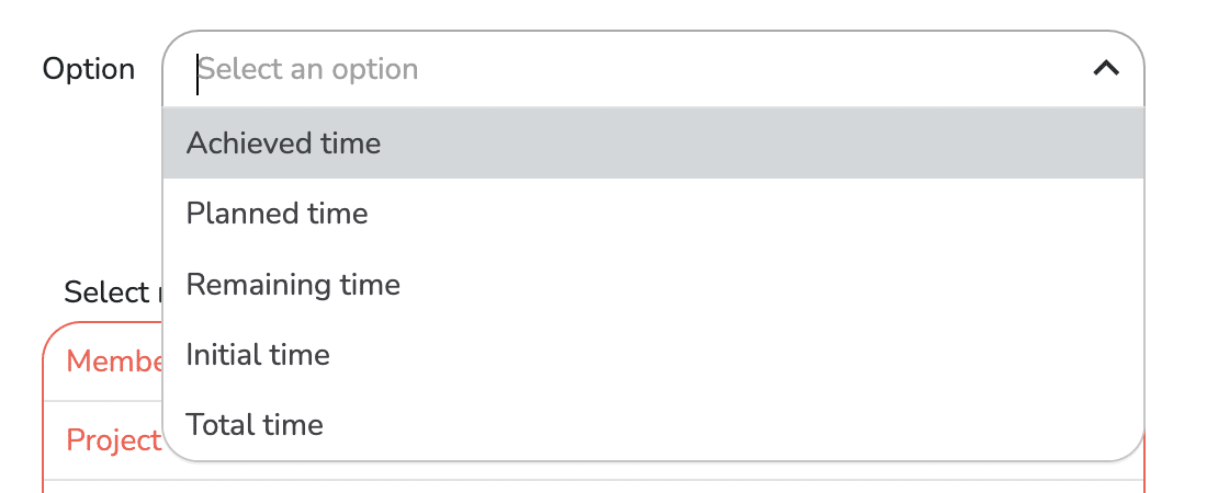
This is the type of time you want to track in your reporting.
For “Sum over Sum” and “Sum versus Sum” calculations, you will have to choose two options, for example, “Planned Time” and “Total Time.”
When a time option is indicated, you must then specify whether you want to report in days or hours:

Choosing row and column elements
After defining the scope and methods for calculating and presenting the data, you can now build your report by choosing the items displayed in rows and columns:
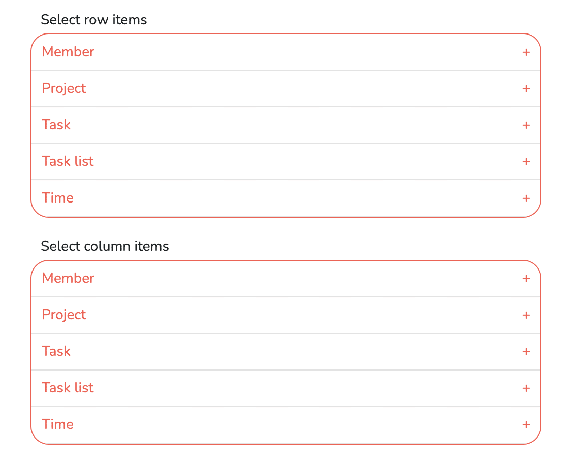
If you want to have the task lists in row, click on the + to the right of “Task list”, and select the “Task list name” item. This will then appear below the selection table:

Whether in rows or columns, you can choose multiple items to display. For example, if you’re reporting to track multiple projects, in rows you can choose to display both project names and task list names:

You can change the order of these elements by dragging and dropping them on top of each other. This changes the order in which these elements are presented in the reporting table.
Displaying reporting data
Once the configuration is complete, go to the right-hand side to access the reporting.
You must:
- Name the reporting.
- Choose a color.
- Choose a period.
- Save.
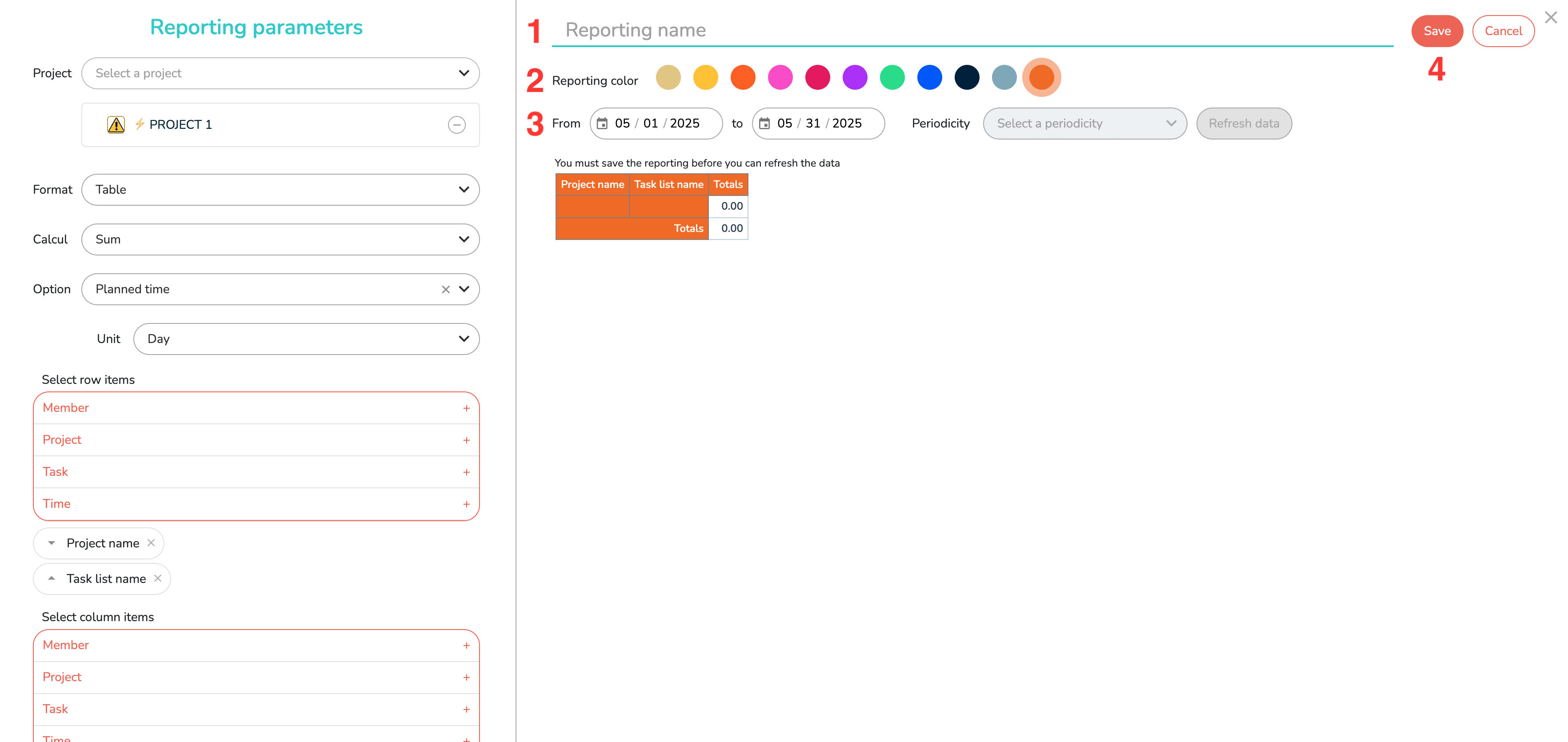
If you have chosen to display “Date of times” in the row or column settings, you must also choose a periodicity (day, week, month, quarter, year).
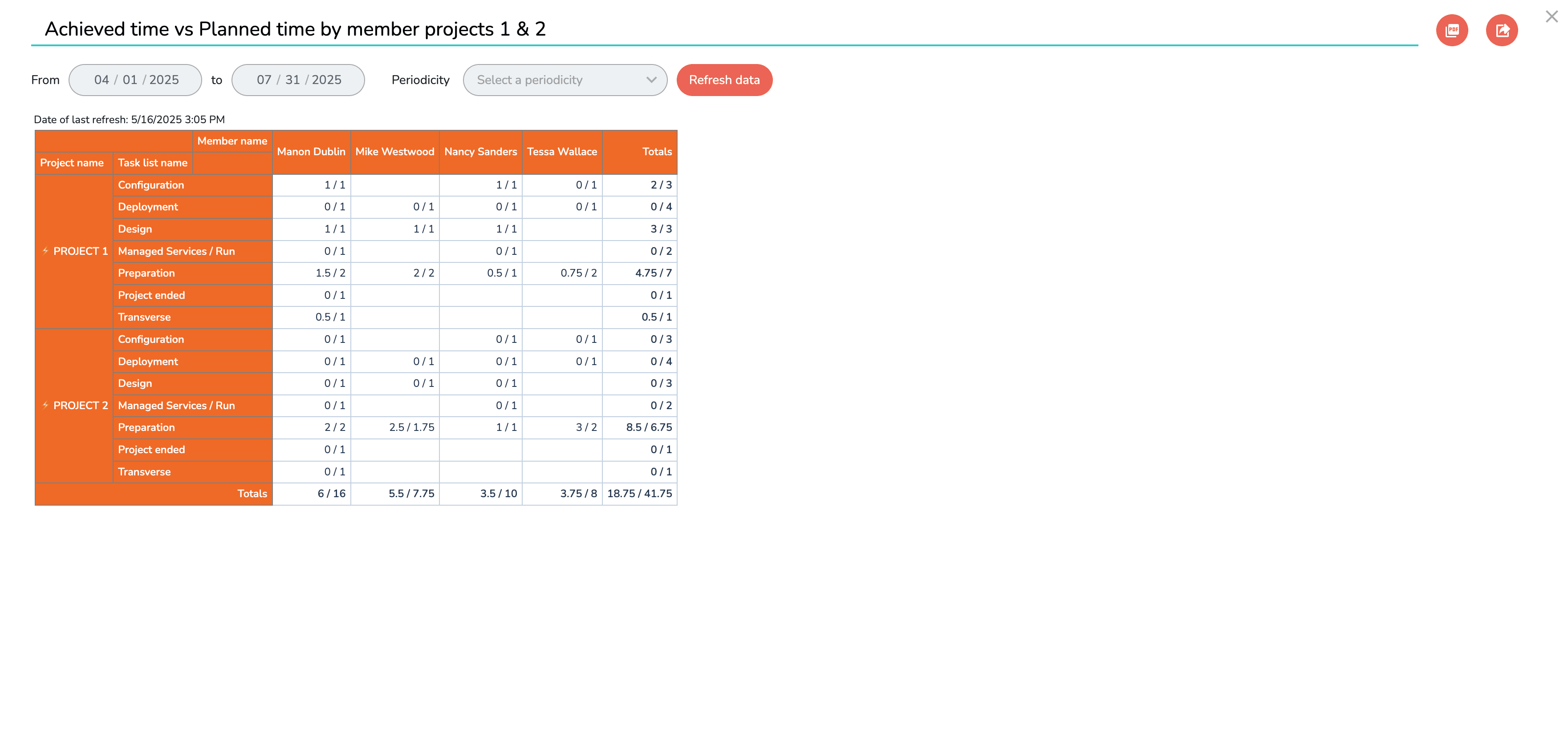
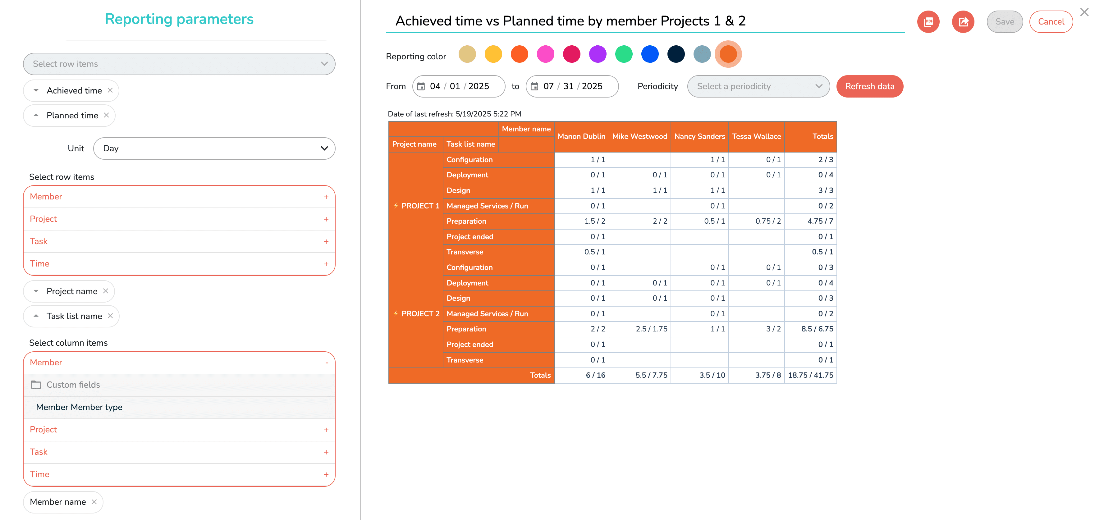
For example, here is a reporting with a monthly frequency, calculated from data spanning a four-month period:

In any case, it is only after having saved your reporting for the first time that you can click on the “Refresh data” button, which will allow you to obtain the updated data for your reporting:

After you click “Refresh data”, Beesbusy presents your reporting to you:
If the reporting doesn’t quite meet your needs, you can modify its settings. You’ll then need to refresh the data again to see the impact of your new settings.
You can also modify it later if you wish.
All your saved reportings then appear as cards in the dashboard “Reporting” tab:

Using the three-dot menu in the top right corner, you can delete or modify them.
Finally, clicking on a reporting opens it, allowing you to view it, refresh the data, and also print it as a PDF or export it to Excel: